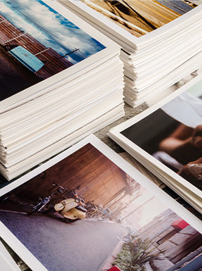
Upload an image > Print.
"Oh, what? My printed picture doesn't look anything like what I see on my screen."
Well, mimicking the original image or artwork as closely as possible isn't as simple as sending an image to print: It requires a wealth of knowledge of colors and how to use certain tools.
In order to get the best results possible, here are some important points to consider before starting fine art printing and reproduction. Let's dive in.
Calibration software
If you're just starting to dip your toes in the water of printing, one of the first things to learn about is calibration software. In a nutshell, it is a device that is periodically attached to a computer monitor, which measures the kind of light and color in the room and in the computer.
Have you ever bought a red t-shirt, then realized it was actually pink after leaving the store? Then you know that colors look different under different lights. Therefore, for professional photographers and artists, calibration software is essential to ensure that the colors in the computer and printed work match.
Paper
A wide variety of paper options are available for you to choose from according to your projects and budget. When reproducing a historical photograph, perhaps it is important to mimic the original paper finish. Or possibly going in a new direction and printing a photo that was glossy on a matte paper may change the feel to suit a certain goal. A bright white finish will pop more, and a deeper, more natural white finish will soften highlights. The most important thing to understand when choosing a paper is that there are no bad choices, just personal taste, and aesthetics.
Professional papers are most commonly used for printing out pictures because they are lighter weight and more affordable than fine art papers. They vary in finishes, such as glossy, pearl, and matte; or tones such as natural white or bright white. These are less expensive because they're lighter weight. And, oftentimes, they're completely sufficient for most people's projects.
Fine art papers also come in different shades of white, like professional papers. However, working with fine art papers can be more rich. They are heavier weight and have varying textures, which makes them more expensive. Let's say that you have a painting or a watercolor work; fine art papers will help you preserve the original texture when copying the piece. Or for true photography nerds, there are Baryta papers reminiscent of true darkroom papers.
Printer
Printers have different ranges of inks that they use. For instance, some printers don't have blue and red inks, which might affect the final result since these colors are pretty hard to match in art reproduction. (That's why I went from using Epson printers to Canon to have greater accuracy.)
Let's take Canon PRO-1000 as an example. Its inkset uses 11-color ink cartridges and a chroma optimizer, which reduces the difference in ink droplet height to form a smoother uniform surface on glossy or semi-gloss papers. The result is more evenly reflected light for truer print colors with richer, darker blacks, vivid colors, and less bronzing.
Pigment inks are designed to be stable over long periods of time, allowing prints to be displayed (under proper conditions) for many decades. On top of that, Canon's individual ink system can help increase efficiency by reducing waste and saving you money since you'll only be replacing the color that runs out.
ICC profiles
An ICC profile can be considered as the 'colorimetric identity card' of a peripheral and will adjust the unique way a paper should be printed on any specific printer.
Different finishes and weights of paper require specific amounts of ink to accurately represent the project's color depth. Papers have their own profiles, for each printer, as an accuracy guide. If you want to print a picture on a fine art pearl paper, you need to select the ICC profile that goes with this paper. This way, the printer can know how much ink to put out on the paper.
For instance, fine art papers can handle more ink because they're heavier than professional papers. In order to have a smooth finish, they need to have a slightly different amount of ink. Besides, there are some papers that are really bright white, while some are off-white. So, the colors need to be adjusted slightly for that kind of tone.
If you are keen to learn more about fine art printing and reproduction, read my blog. And If you have any art or photography projects, I can help you print them out.